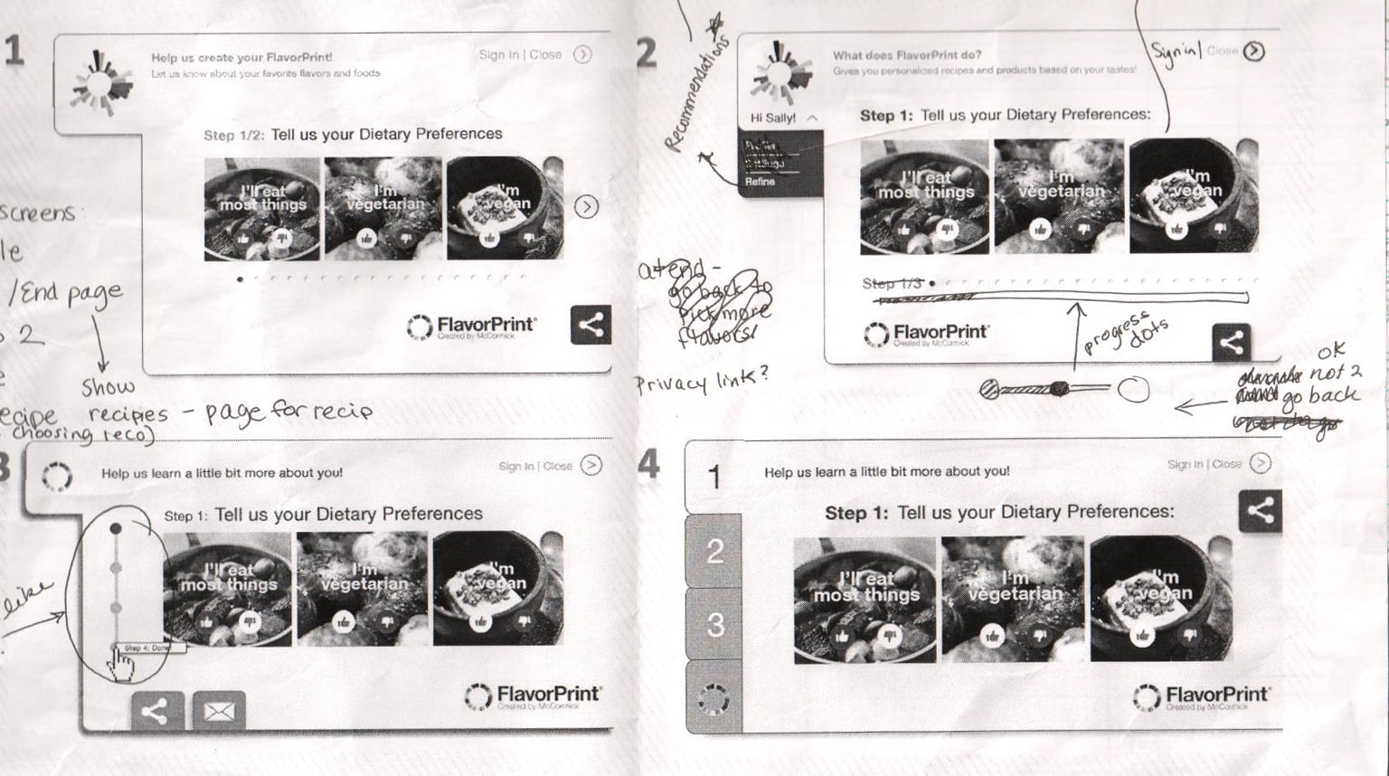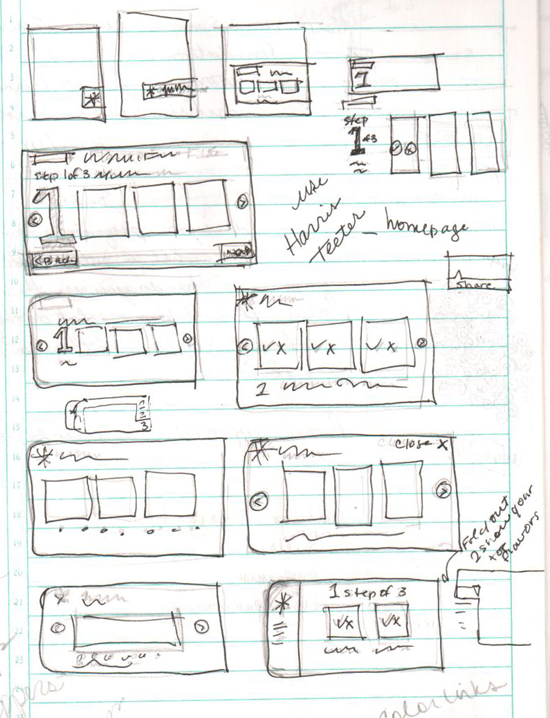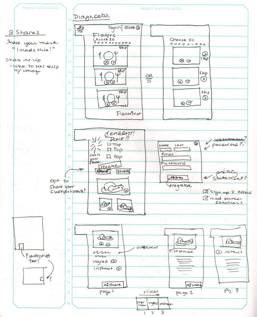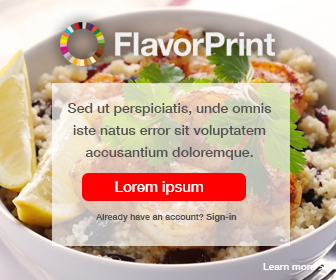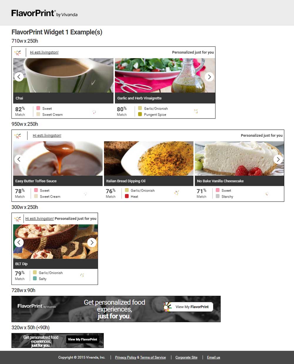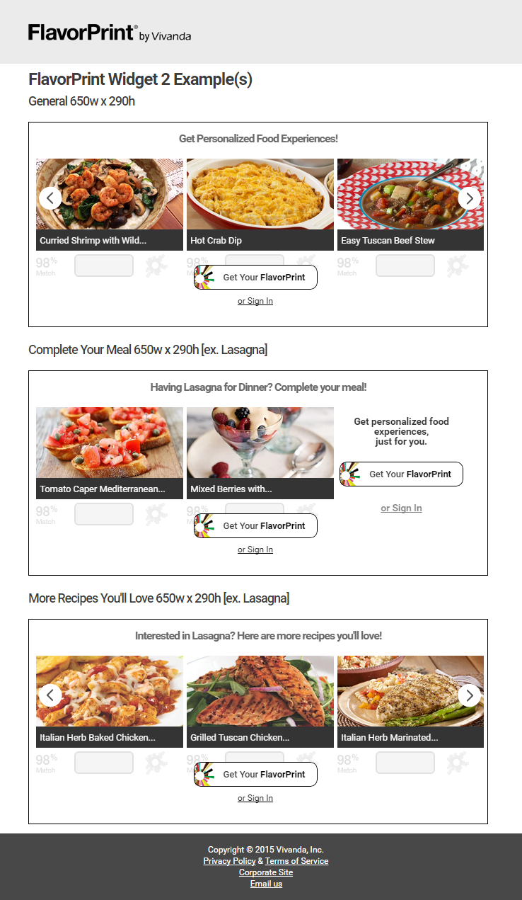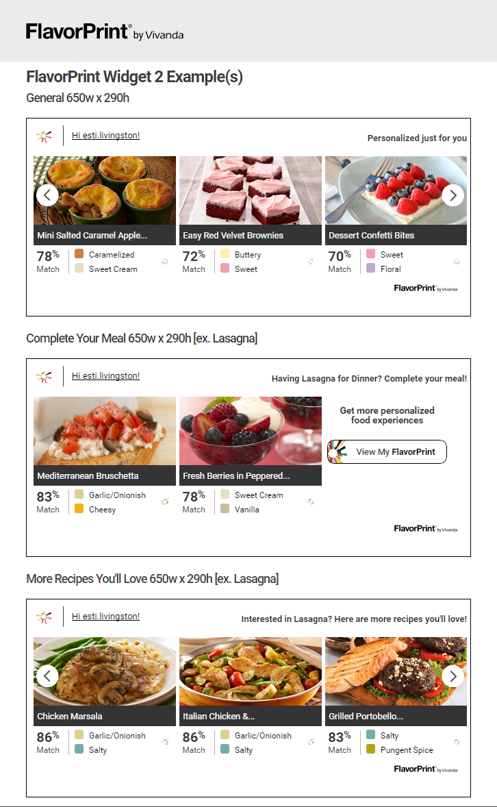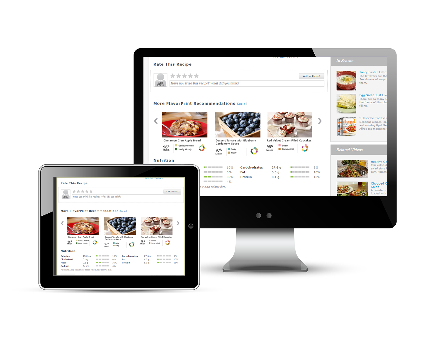
FlavorPrint is a robust service, utilizing multiple factors (flavors, cooking styles, time of day, etc.), that provides personalized product and recipe recommendations based on your personal taste preferences. The problem was condensing the main benefits into a bit sized iframe widget while remaining true to the variable contexts of the sites they sit on?
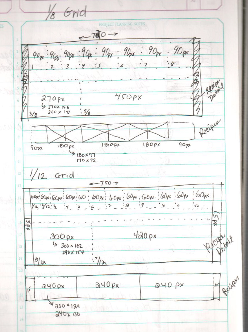
Several factors had to be examined. For example, each type of user need to be taken into account. An inexperienced user, who isn’t familiar with FlavorPrint would need intuitive education on the benefits of FlavorPrint. Additionally, since I did the front-end coding and design – what is the best sizing across use cases? What is the perfect ratio to display the best amount of recommendations? And how many recommendations? And how to show if you are logged into the service, vs not? As the User Experience & User Interface Designer – I was ground zero to answer these fascinating questions.
To develop the working product, we worked in a team of two (A talented Web Developer connected and restructured the backend API code using C#). I was responsible for the UI/UX Development, the Overall Visual Design, and the Front-end Development (Responsive CSS, JQuery, Cross-browser compatible, API integration).
Sketches
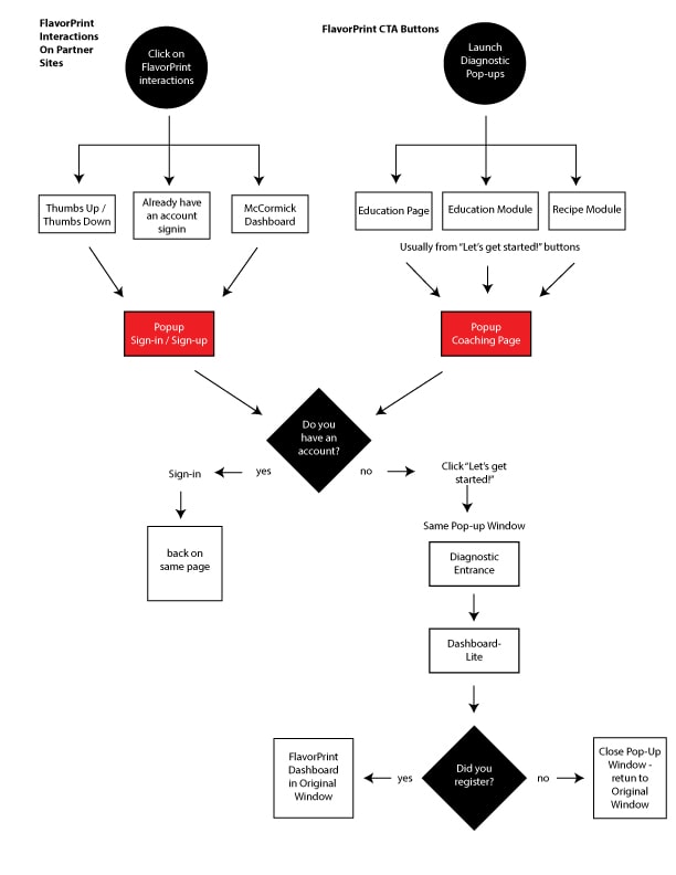
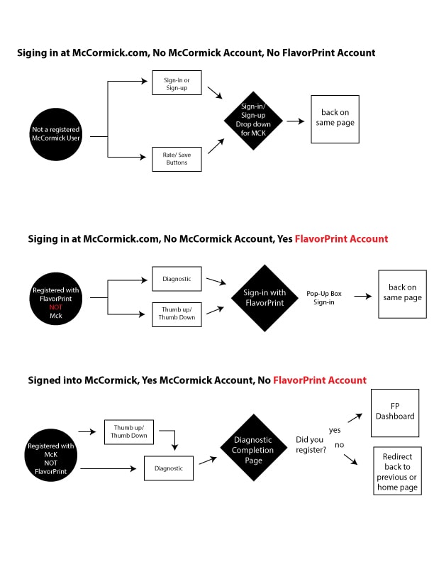
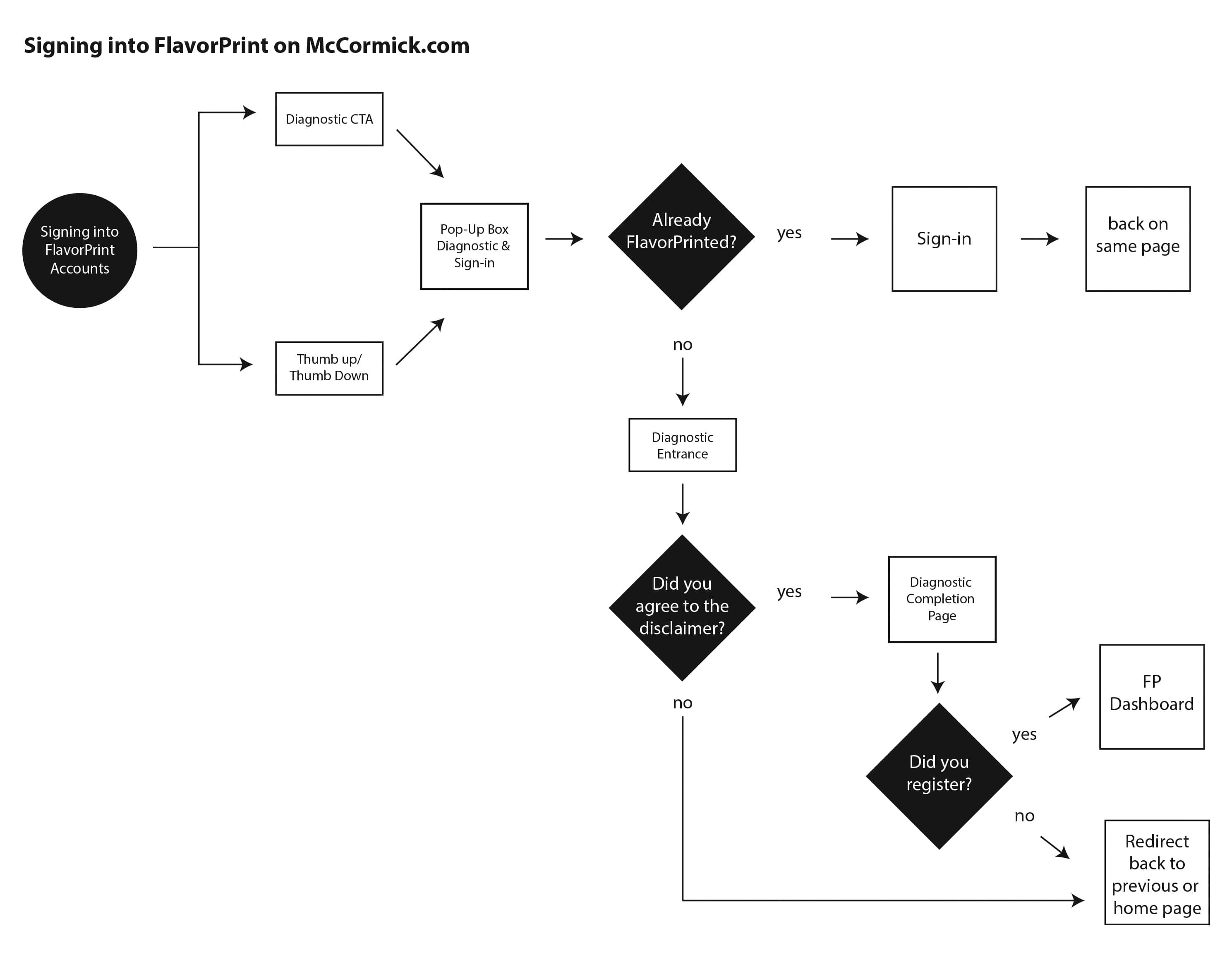
Process Flows
To better design the most useful experience, it was important to understand how the users would be interacting with the site. Did they already have a FlavorPrint account? Were they coming from a partner site?
Depending on the originating site and if they were logged in, we would display different portals with different messaging. For example, if the user did not yet have an account, we would display content expressing the benefits of an account and their top flavor choices based on anonymous data collected.
By creating these process flows, we were able to target the user experience and highlight the technical requirements for each use case.

