In an effort to further evolve the FlavorPrint service platform, the myflavorprint.com experience needed to focus more on flavor personalization instead of creating a recipe destination. The goal of the new site is to educate the user on their taste preferences and flavor interactions throughout their Network of Food and it’s meaning related to them, creating a more personalized and interactive experience.
Axure Prototype
Similar to the FlavorPrint widgets, it was necessary to explore the differences in logging into the site.
Before the users could access the site, we had to find out: Were they returning users? Did they need to register? etc. Each of these user types would interact with the site differently and would have a different log in process. The Axure prototype was integral in discovering blind spots and creating a seamless user experience.
It also gave a good idea of what content we wanted to present to the user at different key times in their experience.
Dashboard and Account Log in
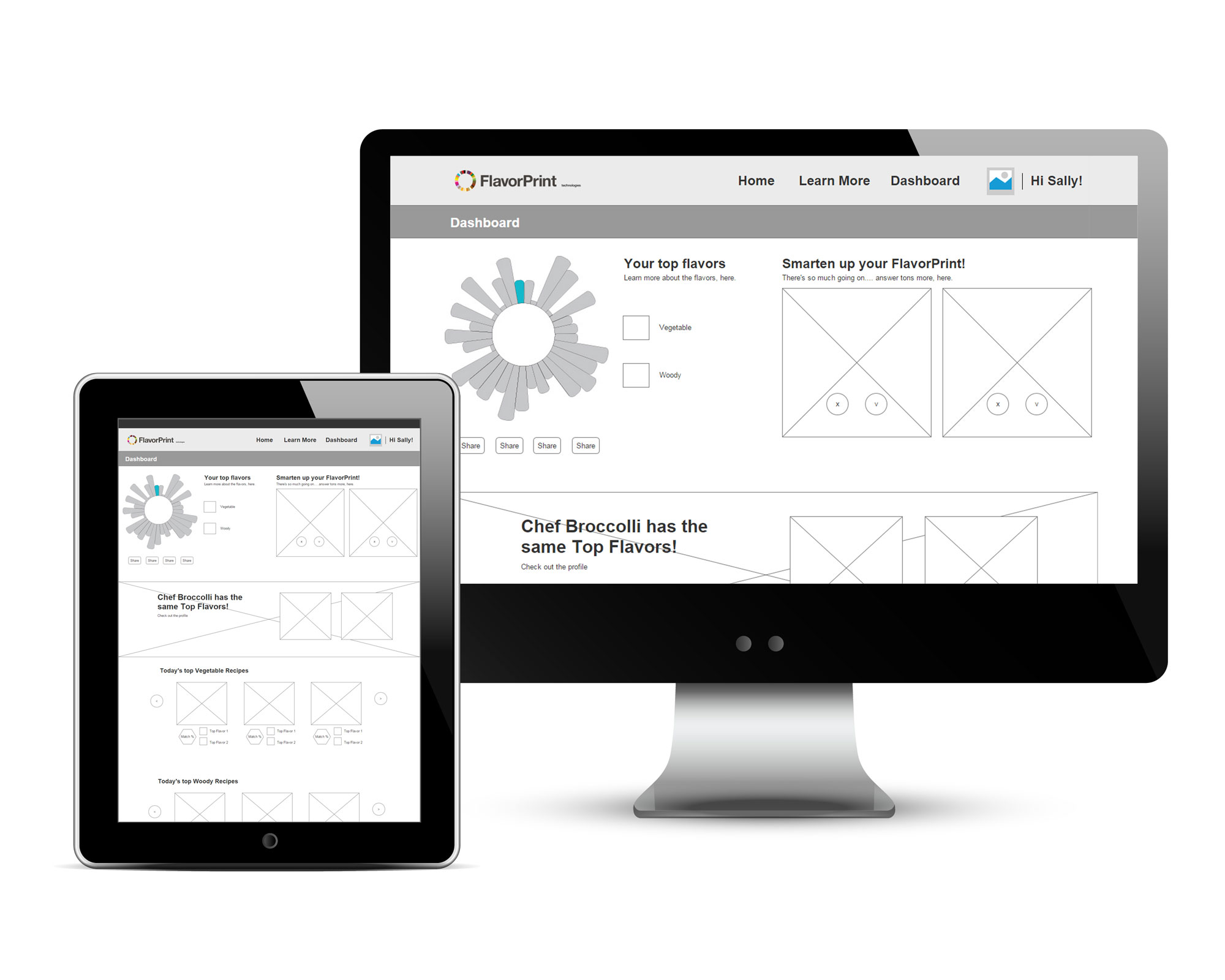
Normally, wireframes are further along in the redesign process. In this case, time was of the essence! Below are the proposed wireframe changes to the FlavorPrint experience in Axure. More emphasis on personalization of the FlavorPrint service – what you can learn about yourself, where you can experience FlavorPrint in the “real” world (restaurants, supermarkets), as well as smoother gamified user flow. Although initially lauded, other projects became priority.
Wireframes
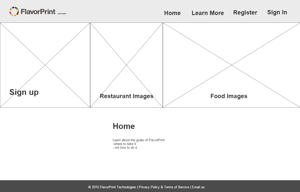
Home Page
rotating photo variety (food experiences, food, products,etc.)
Flavor Education
learn more about each of the 33 flavors that make up the full FlavorPrint profile.
Dashboard
focuses on your FlavorPrint flavors. Displays your top flavors with corresponding recipes and products.
Account Settings
change password, image, name, etc.


